


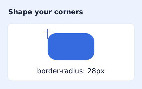
CSS Border Radius Generator
Generate a CSS border-radius declaration from four corner values and preview the shape.
Open toolGenerate a fluid font-size clamp between two viewport widths. Minimum font size cannot exceed maximum.
Enter the inputs, then select Calculate.
Result will appear here
Generate a fluid font-size clamp between two viewport widths.
Minimum font size cannot exceed maximum. Ending width must exceed starting width. Uses px plus vw; no browser preview or rem assumption.
Follow the labelled inputs.
Replace the example with minimum font size (px). The field labels specify the expected format and units.
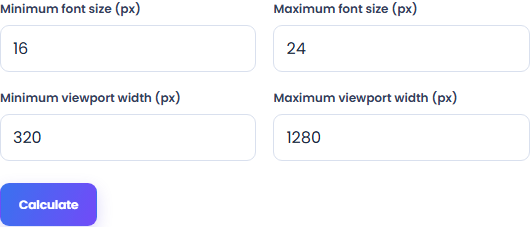
Set maximum font size (px), minimum viewport width (px), maximum viewport width (px). Minimum font size cannot exceed maximum.
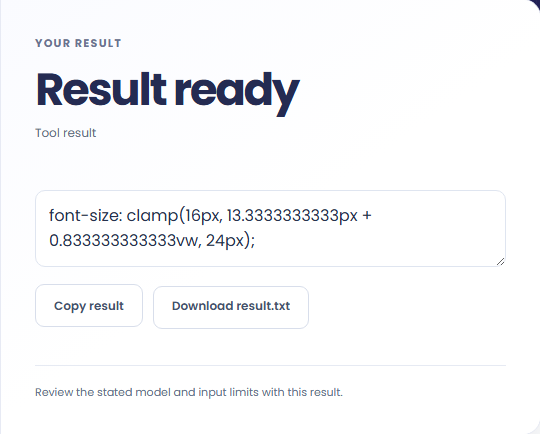
Select Calculate. Review the generated font-size declaration, then copy it or download the result text.
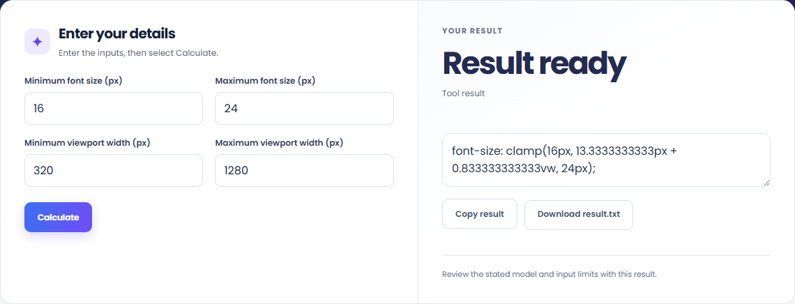
The starting example produces font-size: clamp(16px, 13.3333333333px + 0.833333333333vw, 24px);. Generate a fluid font-size clamp between two viewport widths.

Read the labels for minimum font size (px) and maximum font size (px), minimum viewport width (px), maximum viewport width (px). Minimum font size cannot exceed maximum.

Copy the generated font-size declaration into your working file. Minimum font size cannot exceed maximum.

Read the generated font-size declaration with the input convention.
Check the stated scope before you run it.
Generate a CSS border-radius declaration from four corner values and preview the shape.
Open tool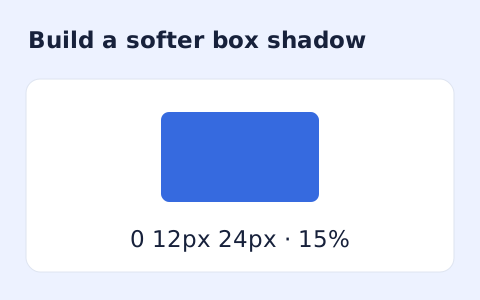
Create a CSS box-shadow declaration from editable shadow settings and copy the result.
Open tool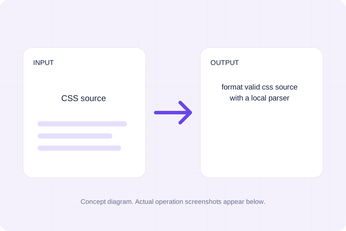
Format valid CSS source with a local parser.
Open toolChoose another tool for your next calculation, conversion, or text task.
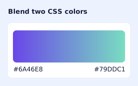
Generate a two-color linear gradient or a circular radial gradient with a browser preview.
Open tool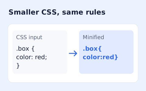
Minify CSS while retaining strings, custom properties, and rule order.
Open tool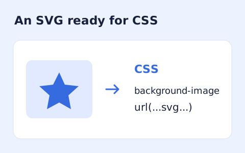
Convert self-contained SVG markup into a CSS background data URI.
Open tool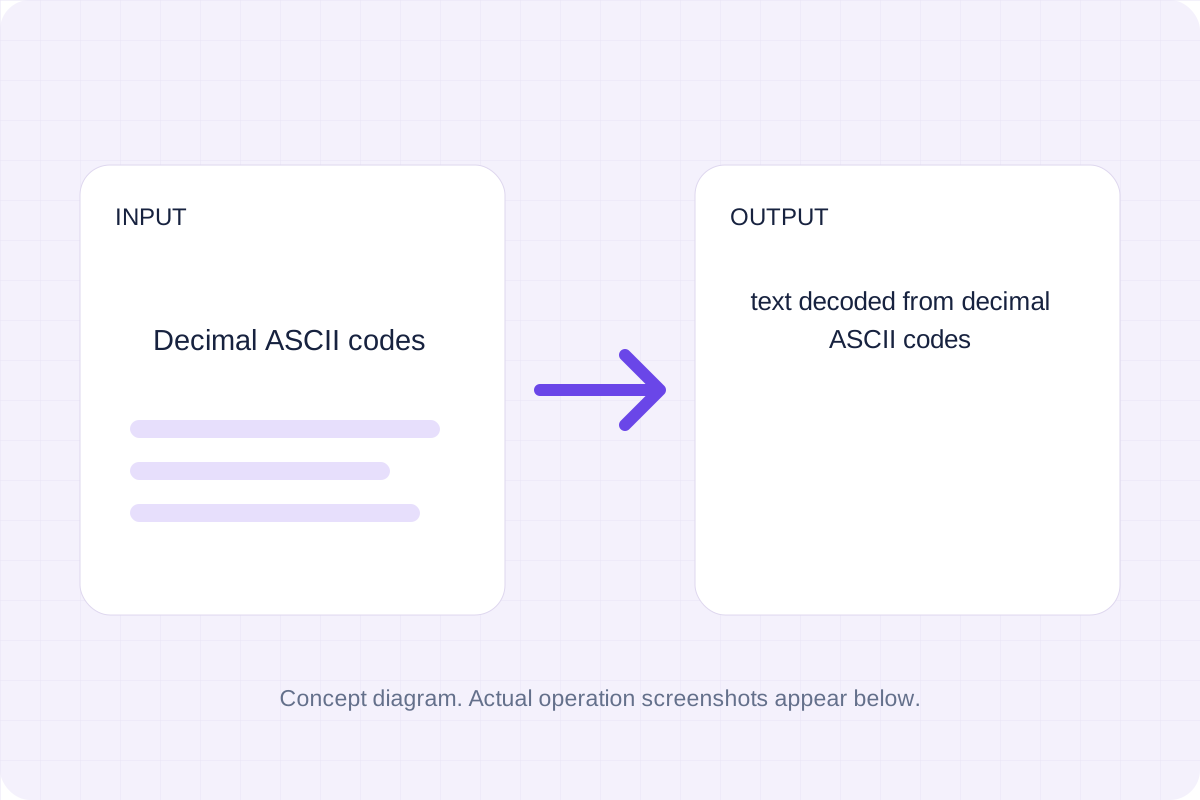
Validate whitespace- or comma-separated integer codes from 0 to 127 and map them to ASCII characters.
Open toolAnswers about using CSS Clamp Generator and understanding its results.
Minimum font size cannot exceed maximum. Ending width must exceed starting width. Uses px plus vw; no browser preview or rem assumption.
Use Copy result to copy the displayed text, or Download to save it as a text file. The tool runs in your browser and does not require an account.
Check the generated font-size declaration, then copy or download it.