
CSS Border Radius Generator
Generate a CSS border-radius declaration from four corner values and preview the shape.
Open toolCreate a CSS box-shadow from offsets, blur, spread, a hex colour, and opacity. Inspect the preview and copy the resulting declaration.
Update the inputs to see your result.
Result will appear here
Offsets and softness settings combine with RGB colour and alpha in one shadow.
The hex colour is parsed into red, green, and blue channels, and opacity is converted to alpha. Those values are combined with horizontal and vertical offsets, blur, and spread to form the box-shadow declaration used by the preview.
Preview uses the same CSS declaration as the copied output. Inset shadows are not included.

Offsets, blur, spread, color and opacity control different parts of one outer shadow.
Set horizontal and vertical offsets, blur, spread, a six-digit hex colour, and opacity. Positive and negative offsets move the shadow in different directions. A negative spread contracts it; this form generates a single outer shadow rather than an inset one.
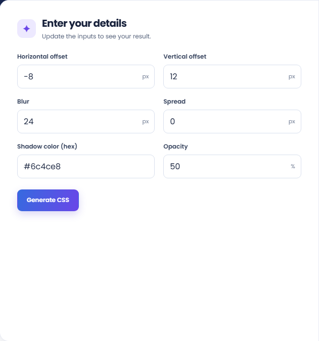
Select Generate CSS and inspect the preview. The colour is converted to RGB channels and opacity to alpha before the declaration is assembled. The preview applies that generated value, so it provides a direct check of the current parameter combination.
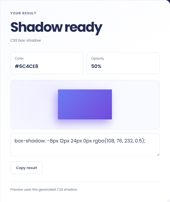
Read the colour and opacity details, then use Copy result for the declaration. Place it in the intended CSS rule and inspect the target background and box. The sample preview cannot reproduce every surrounding layout or clipping condition.
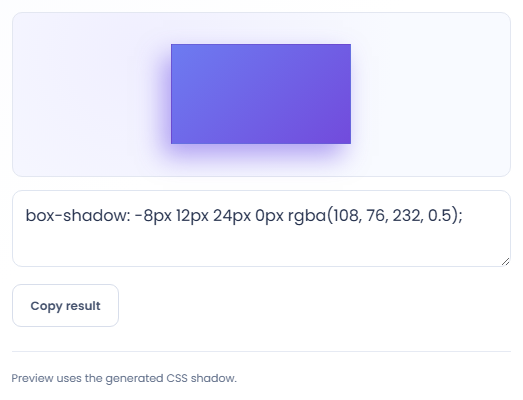
Use the preview to compare one shadow at a time on a known background.
Keep color, opacity, blur and spread fixed while changing one offset. The shadow moves according to that input. This isolates direction from softness and makes it easier to identify a misplaced horizontal or vertical value in a copied style.

Run two settings that change blur alone, then compare settings that change spread alone. The preview demonstrates these distinct inputs on the same box. Check the declaration in your actual component before assuming the preview's size represents the target element.

Keep the shadow geometry fixed and change opacity to compare the same RGB color at different alpha values. Read the generated rgba value beside the preview. The tool does not combine multiple shadows or generate an inset shadow option.

Distinguish offset, blur, spread, and opacity when reading the preview.
The declaration contains horizontal offset, vertical offset, blur and spread followed by an rgba color. The color channels come from the hexadecimal input, while alpha comes from the entered percentage. The preview uses that generated shadow value.
An outer shadow's appearance also depends on the background and nearby content. This page previews a single box and supplies one declaration; it does not produce a full component or evaluate a complete visual design.

Check the accepted colour format and target layout before copying CSS.
Enter a six digit hex color, with or without the hash, and keep numeric units out of the length fields. If the color is rejected, check for a short hex or alpha hex form that this generator does not support.
If the copied shadow differs in your page, inspect other box shadow declarations, the element's clipping context and the surrounding colors. Copying supplies the declaration text only; the tool does not edit or test your target stylesheet.

Generate a CSS border-radius declaration from four corner values and preview the shape.
Open tool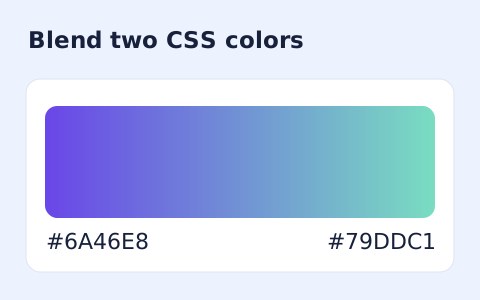
Generate a two-color linear gradient or a circular radial gradient with a browser preview.
Open tool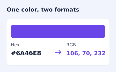
Convert #RGB or #RRGGBB colours into CSS rgb() values and individual red, green, and blue channels.
Open toolChoose another tool for your next calculation, conversion, or text task.
Create one or more RFC 4122 version 4 UUIDs locally and copy them in one click.
Open tool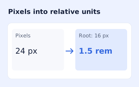
Convert pixel values to CSS rem units with a configurable root font size and a quick reference table.
Open tool
Calculate IPv4 subnet details from an address and CIDR prefix, including /31 and /32 cases.
Open tool
Calculate HMAC-SHA-256, SHA-384, or SHA-512 locally and copy hexadecimal or Base64 output.
Open toolCreate a CSS box-shadow from offsets, blur, spread, a hex colour, and opacity.
Answers about using CSS Box Shadow Generator and understanding its results.
Yes. A negative spread contracts the shadow.
Enter a six-digit hexadecimal colour such as #6c4ce8.
No. The current generator produces an outer shadow only; it does not add the inset keyword.
No. The current form generates one shadow declaration from one set of settings. Additional layers need separate CSS editing.