
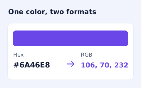
Hex to RGB Converter
Convert #RGB or #RRGGBB colours into CSS rgb() values and individual red, green, and blue channels.
Open toolCheck the WCAG 2 contrast ratio between an opaque text color and background. This online color contrast checker shows AA and AAA outcomes for normal and large text.
Enter the inputs, then select Check contrast.
Result will appear here
The checker converts two opaque hexadecimal colors to relative luminance and compares their unrounded contrast ratio with the displayed thresholds.
The displayed ratio is rounded to two decimal places. The normal and large text outcomes describe this color pair; they do not certify the accessibility of a whole page.
Enter a three digit or six digit hexadecimal color for each field.
Reference: W3C: Contrast minimum.

Enter the opaque text color and the opaque background color used together in the component.
Enter the hexadecimal text color and the solid background immediately behind it. Use the component values rather than a nearby border or panel color. Alpha and image backgrounds are outside this pair calculation.
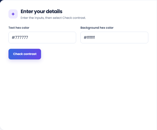
Run the checker and inspect the ratio and color-pair preview. The ratio shown is rounded for display, while threshold checks use the full calculated value.
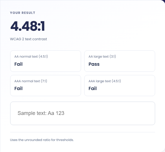
Review AA and AAA for normal and large text separately, using the actual font size and weight. The supporting rows describe this pair; the note does not certify the rest of the interface.
A pairwise contrast result helps evaluate a defined text treatment before checking the full interface.
Test body copy against the page background before adding it to a style guide. Use the normal text outcome unless the rendered text qualifies as large. A heading label in the design file does not determine its contrast category.

Enter the label color and the solid button fill to inspect that state. Repeat for each fill used by hover or focus. If the button has a gradient, identify the colors behind the letters separately instead of treating one endpoint as the whole background.

Test alternative colors for secondary information such as captions or counts. Record which pair each result refers to so the design discussion stays tied to a specific background. Contrast alone does not decide whether the information is visually prominent enough.

Match each threshold result to the text size or interface element you intend to check.
The displayed ratio is rounded to two decimal places, while pass or fail uses the unrounded value. A ratio displayed near a threshold can therefore look equal to it while still failing.
AA requires 4.5 for normal text and 3 for large text; AAA requires 7 and 4.5 respectively. These labels describe this color pair, not a certification of the entire page.

Choose the actual foreground and background colors before applying the result to a design.
Enter a three digit or six digit hexadecimal color for each field. Alpha colors, images, and gradients are not modeled here, so first determine the resulting opaque colors behind the text.
If a passing pair remains difficult to read, inspect font size, weight, spacing, and the surrounding layout. The tool does not audit keyboard access, alternative text, semantics, or other accessibility requirements.

Convert #RGB or #RRGGBB colours into CSS rgb() values and individual red, green, and blue channels.
Open tool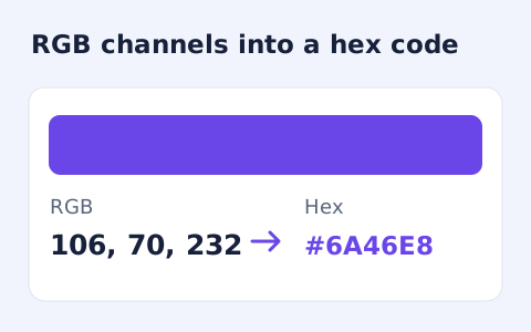
Convert RGB channel numbers into a six-digit hexadecimal CSS colour and preview it.
Open tool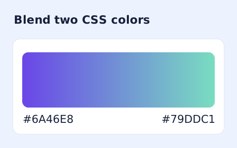
Generate a two-color linear gradient or a circular radial gradient with a browser preview.
Open toolChoose another tool for your next calculation, conversion, or text task.

Create an approximate search-result snippet and inspect title width and text length.
Open tool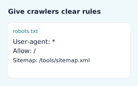
Generate robots.txt from a user-agent token and newline-separated allow and disallow paths.
Open tool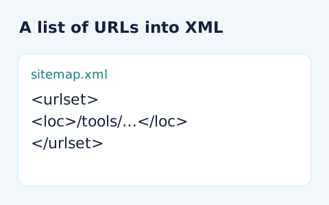
Generate sitemap XML from a list of absolute page URLs.
Open tool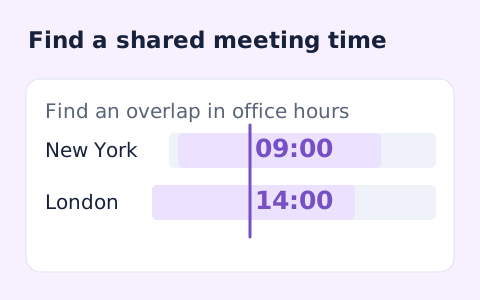
Plan a dated meeting across IANA time zones and check typical weekday office hours.
Open toolAnswers about using Color Contrast Checker and understanding its results.
No. It checks one opaque text/background color pair only.
No. Threshold checks use the unrounded ratio.
Alpha is not modeled here. Determine the resulting opaque foreground and background before entering the pair.
This calculation accepts two opaque hexadecimal colors. A gradient has different colors at different positions, so one endpoint does not describe the whole background.
Enter the opaque text color and the opaque background color used together in the component.