
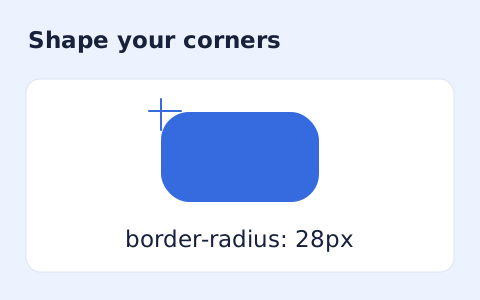
CSS Border Radius Generator
Generate a CSS border-radius declaration from four corner values and preview the shape.
Open toolConvert a pixel value into CSS rem units using your root font size. Review the conversion and a small reference table for common pixel values.
Update the inputs to see your result.
Result will appear here
A pixel value is divided by the entered root font size.
The pixel value is divided by the entered root font size to produce rem. The same denominator is applied to the reference-table values; actual rendering still depends on the computed font size of the html element.
The common 16 px root is a default, not a guarantee. Check the actual computed root font size in your CSS.

The root font size defines what the converted rem value means in a particular stylesheet.
Enter the pixel value and a positive root font size in pixels. Use the target page’s root size if you know it, rather than assuming the default value applies. The converter does not inspect or update another website’s styles.

Select Calculate and read the CSS rem value. The page divides the entered pixels by the root size and formats the result to four decimal places. This changes unit notation; actual rendering still depends on the target document’s computed root font size.
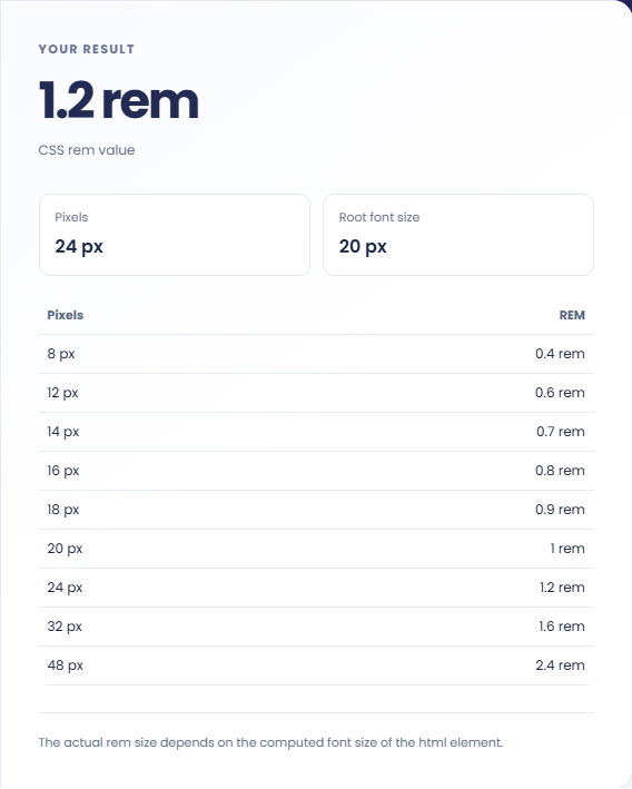
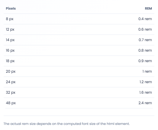
Check Pixels, Root font size, and the common-size reference table. Each table value uses the same entered root size. Test a converted value in the target layout before assuming it reproduces an intended spacing or text size across contexts.
Keep the root assumption with converted lengths when sharing them with another developer.
A hypothetical twenty four pixel spacing value with a sixteen pixel root becomes 1.5 rem. Put the converted value into the intended CSS property yourself. The page does not rewrite stylesheets or inspect the computed layout of a website.

Use the reference table to compare common pixel values under one root setting. Change the root and the whole table uses the new basis. This makes it easier to keep a conversion sheet internally consistent without calculating each listed value separately.

Enter a root size that matches your target page, then repeat the conversion. A different root can produce a different numerical rem value for the same pixels. Confirm the computed html font size before comparing conversions from different projects.

Read the conversion as a ratio that depends on the target root size.
The main result is rounded to four decimal places for display. Each reference row also uses the entered root size. The output is a unit conversion and does not guarantee the same visible size under a different root.
A rem value is a length relative to the root font size. This page does not calculate em units, whose reference can differ, or account for responsive style changes in the surrounding document.

Confirm the computed root size and test the value in the target layout.
A zero root cannot define the conversion. Enter a positive computed root size and keep units out of the numeric fields. If a rendered element looks different, check the actual root and applicable CSS rules in that page.
This tool presents the value and a reference table. It does not provide a stylesheet upload, a batch CSS rewrite or a generated CSS download. Use the result in your own declaration and verify the component in context.

Generate a CSS border-radius declaration from four corner values and preview the shape.
Open tool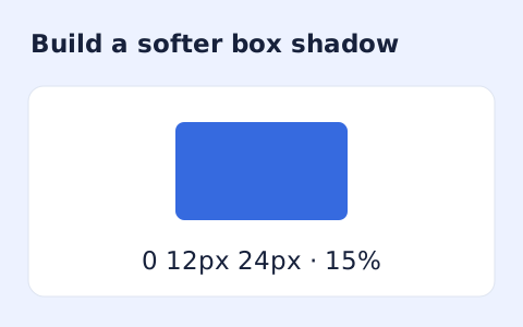
Create a CSS box-shadow declaration from editable shadow settings and copy the result.
Open tool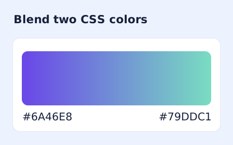
Generate a two-color linear gradient or a circular radial gradient with a browser preview.
Open toolChoose another tool for your next calculation, conversion, or text task.
Create one or more RFC 4122 version 4 UUIDs locally and copy them in one click.
Open tool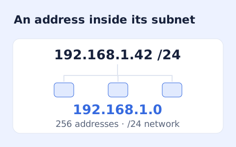
Calculate IPv4 subnet details from an address and CIDR prefix, including /31 and /32 cases.
Open tool
Calculate HMAC-SHA-256, SHA-384, or SHA-512 locally and copy hexadecimal or Base64 output.
Open tool
Generate a Unix-style cron expression from minute, hour, day-of-month, month, and weekday fields.
Open toolConvert a pixel value into CSS rem units using your root font size.
Answers about using PX to REM Converter and understanding its results.
One rem equals the computed font size of the root html element.
Yes. Enter the root font size used by your project.
No. Enter the root font size yourself. The page does not read styles from another website.
No. It provides a unit conversion. How rem values behave depends on the root font size and the styles in the receiving layout.