
CSS Box Shadow Generator
Create a CSS box-shadow declaration from editable shadow settings and copy the result.
Open toolSet four pixel corner radii, preview the shape, and copy a CSS border-radius declaration in top-left, top-right, bottom-right, bottom-left order.
Update the inputs to see your result.
Result will appear here
Four pixel values are placed in CSS corner order and applied to the preview.
The four corner values are formatted in CSS shorthand order and appended with px units. The resulting border-radius value is applied to the preview and included in the copyable declaration.
Uses pixel radii. The visible corner curve can be reduced by CSS when the combined radii exceed box dimensions.

The four inputs map to the four corners in CSS declaration order.
Enter top-left, top-right, bottom-right, and bottom-left radii in pixels. Use different values to inspect individual corners or equal values for a consistent rounded shape. This form does not offer percentage or elliptical-radius syntax.
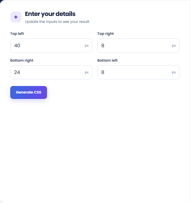
Select Generate CSS and review the shape preview and four-value result. The page applies the same border-radius value to the preview that it includes in the declaration. Keep the CSS corner order with the values when reading the output.
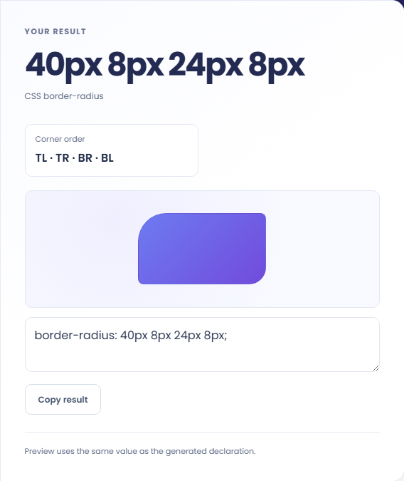
Use Copy result to take the border-radius declaration into a CSS rule. The output is one property rather than a complete stylesheet. Actual curves can be reduced when radii exceed box dimensions, so check the intended element size after applying it.
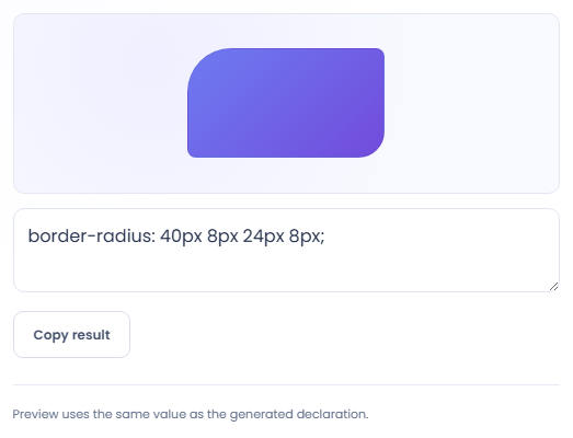
Use the preview to inspect corner differences before testing the declaration in its target layout.
Give all four corners the same pixel value to preview a consistently rounded rectangle. Check the declaration's four values before applying it. The preview shows one example box and does not determine the dimensions of the element in your own page.

Give top left and bottom right one value, then top right and bottom left another. This produces a recognisable asymmetric pattern. Changing a single input shows which corner it controls and helps prevent reversing the order in a copied declaration.

Try a larger radius and inspect it in the actual element after copying. CSS can reduce visible corner curves when combined radii exceed box dimensions. A preview on one sized box therefore cannot predict every component's exact appearance.

Read the corner sequence with the actual box dimensions in mind.
The generated order is top left, top right, bottom right and bottom left. The preview applies the same radius string as the text output. Keeping the order explicit helps preserve an asymmetric design when moving it into CSS.
This tool generates pixel radii. It does not create elliptical radii with slash syntax or convert values into percentages or rem units. Surrounding dimensions can affect the visible curves even when the declaration stays unchanged.

Check supported units and test the declaration on the intended element.
If the target shape differs from the preview, inspect its dimensions and competing CSS rules. Check that the declaration applies to the element you intended. The generator does not inspect a webpage or resolve its style cascade.
If copying is unavailable, select the generated declaration manually. There is no stylesheet download or file import. Use PX to REM Converter separately if you need to convert a length before writing a different CSS declaration.

Create a CSS box-shadow declaration from editable shadow settings and copy the result.
Open tool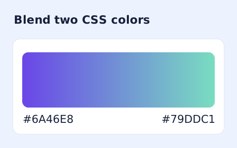
Generate a two-color linear gradient or a circular radial gradient with a browser preview.
Open tool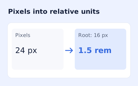
Convert pixel values to CSS rem units with a configurable root font size and a quick reference table.
Open toolChoose another tool for your next calculation, conversion, or text task.
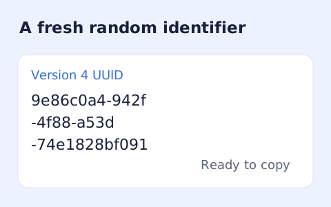
Create one or more RFC 4122 version 4 UUIDs locally and copy them in one click.
Open tool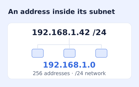
Calculate IPv4 subnet details from an address and CIDR prefix, including /31 and /32 cases.
Open tool
Calculate HMAC-SHA-256, SHA-384, or SHA-512 locally and copy hexadecimal or Base64 output.
Open tool
Generate a Unix-style cron expression from minute, hour, day-of-month, month, and weekday fields.
Open toolSet four pixel corner radii, preview the shape, and copy a CSS border-radius declaration in top-left, top-right, bottom-right, bottom-left order.
Answers about using CSS Border Radius Generator and understanding its results.
Top-left, top-right, bottom-right, and bottom-left.
Yes. Use Copy result beneath the generated declaration.
No. The current form outputs four pixel values. It does not expose percentage units or slash-separated elliptical radii.
CSS can reduce combined radii when they exceed box dimensions. Test the declaration on the actual element size rather than relying only on this preview.