

CSS Gradient Text Generator
Generate cross-browser CSS gradient text code with linear-gradient or radial-gradient, background-clip: text, -webkit-text-fill-color, and fallback color.
Open toolSet your X/Y pixel offsets, Gaussian blur radius, HEX color, alpha opacity, and layering preset to generate single or multi-layered CSS text-shadow code.
Enter the inputs, then select Generate Text Shadow CSS.
Result will appear here
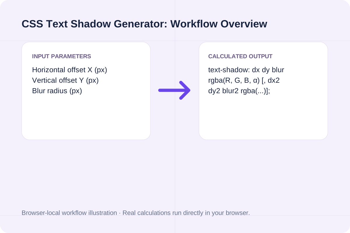
The generator converts your HEX color and opacity into an exact `rgba(r, g, b, a)` value and builds single or stacked comma-separated `text-shadow` layers.
text-shadow: dx dy blur rgba(R, G, B, α) [, dx2 dy2 blur2 rgba(...)];
Blur radius must be non-negative (>= 0px); X and Y offsets accept negative or positive pixel values.
Standard CSS text-shadow recipes for UI legibility, ambient elevation, neon halos, and 3D typography.
| Effect Preset | CSS Declaration Pattern | Blur Radius | Best Use Case |
|---|---|---|---|
| Subtle Hero Legibility | 0px 2px 6px rgba(15, 23, 42, 0.35) | 4px - 8px | White text overlaid on photography or video banners. |
| Dual Ambient Elevation | 0px 2px 4px rgba(...), 0px 8px 16px rgba(...) | 4px + 16px | Modern SaaS display headers needing soft depth. |
| Multi-Layer Neon Glow | 0 0 6px C, 0 0 16px C, 0 0 32px C | 6px / 16px / 32px | Dark-mode cyber/gaming badges and glowing accents. |
| Crisp 3D Extrusion | 1px 1px 0 C, 2px 2px 0 C, 3px 3px 0 C | 0px (Hard edge) | Retro poster headlines and isometric number badges. |
Configure your shadow geometry and copy the ready-to-use CSS rule.
Specify horizontal and vertical pixel offsets plus a non-negative blur radius.
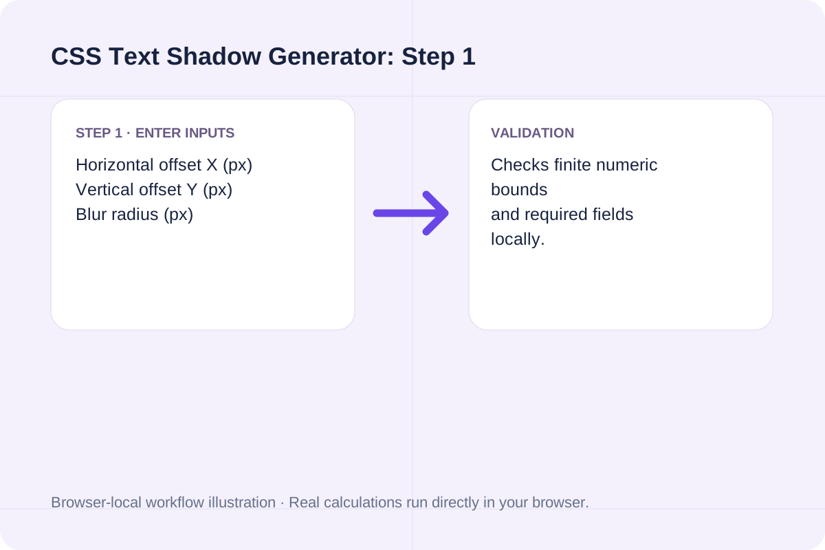
Provide any 3-digit or 6-digit HEX color and an alpha value between 0.05 and 1.0.
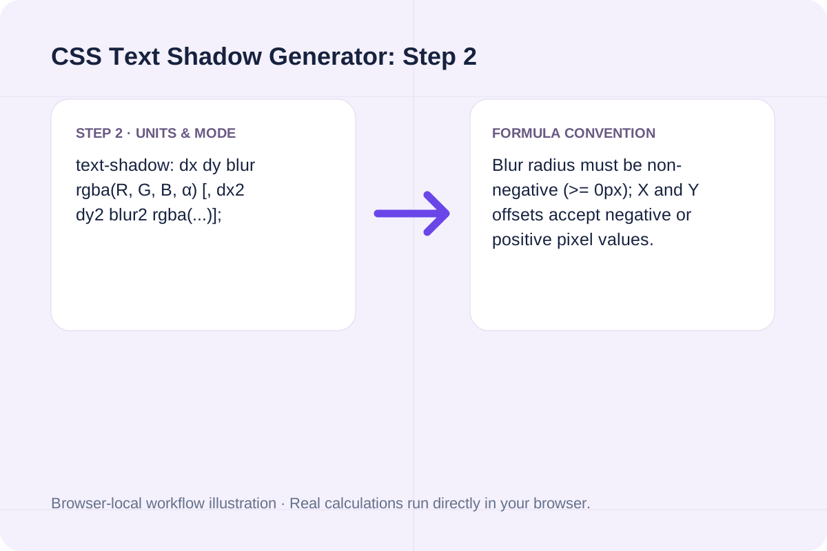
Click Generate Text Shadow CSS to output the CSS property, Tailwind arbitrary utility, and layer breakdown.
Compare single-layer and multi-layer shadow outputs.
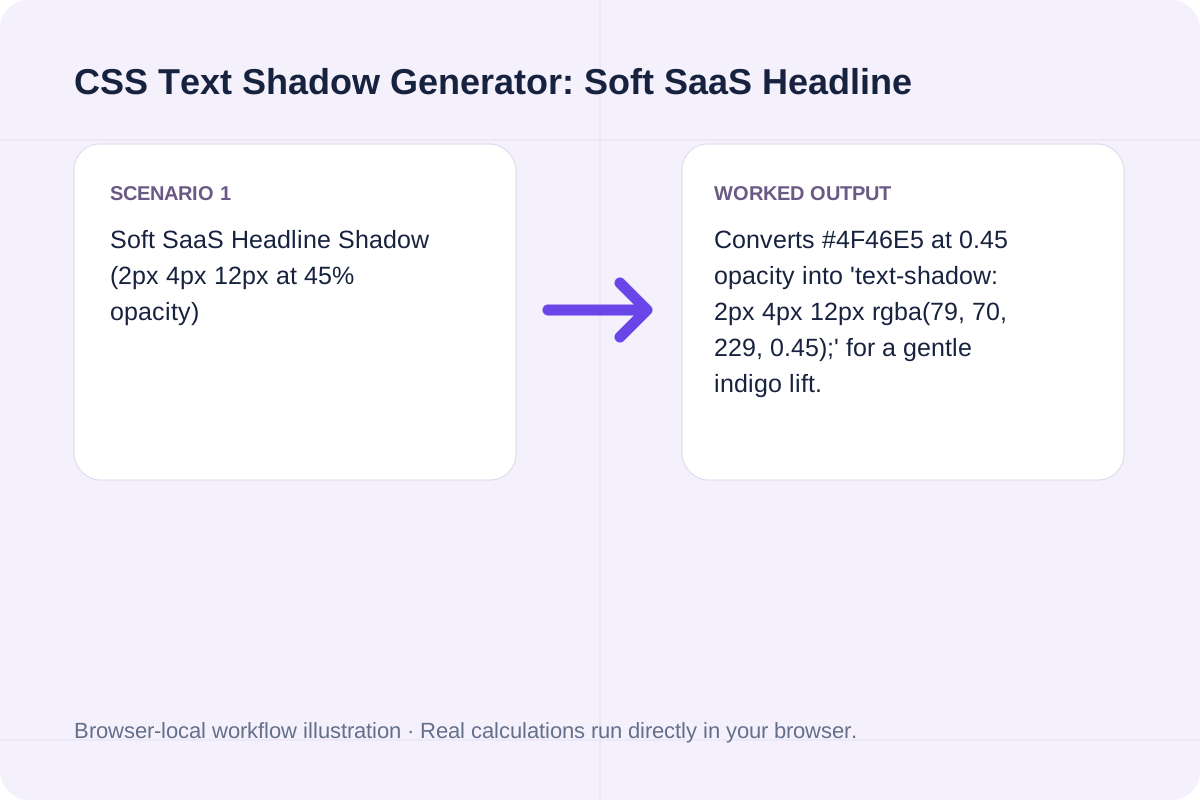
Converts #4F46E5 at 0.45 opacity into 'text-shadow: 2px 4px 12px rgba(79, 70, 229, 0.45);' for a gentle indigo lift.
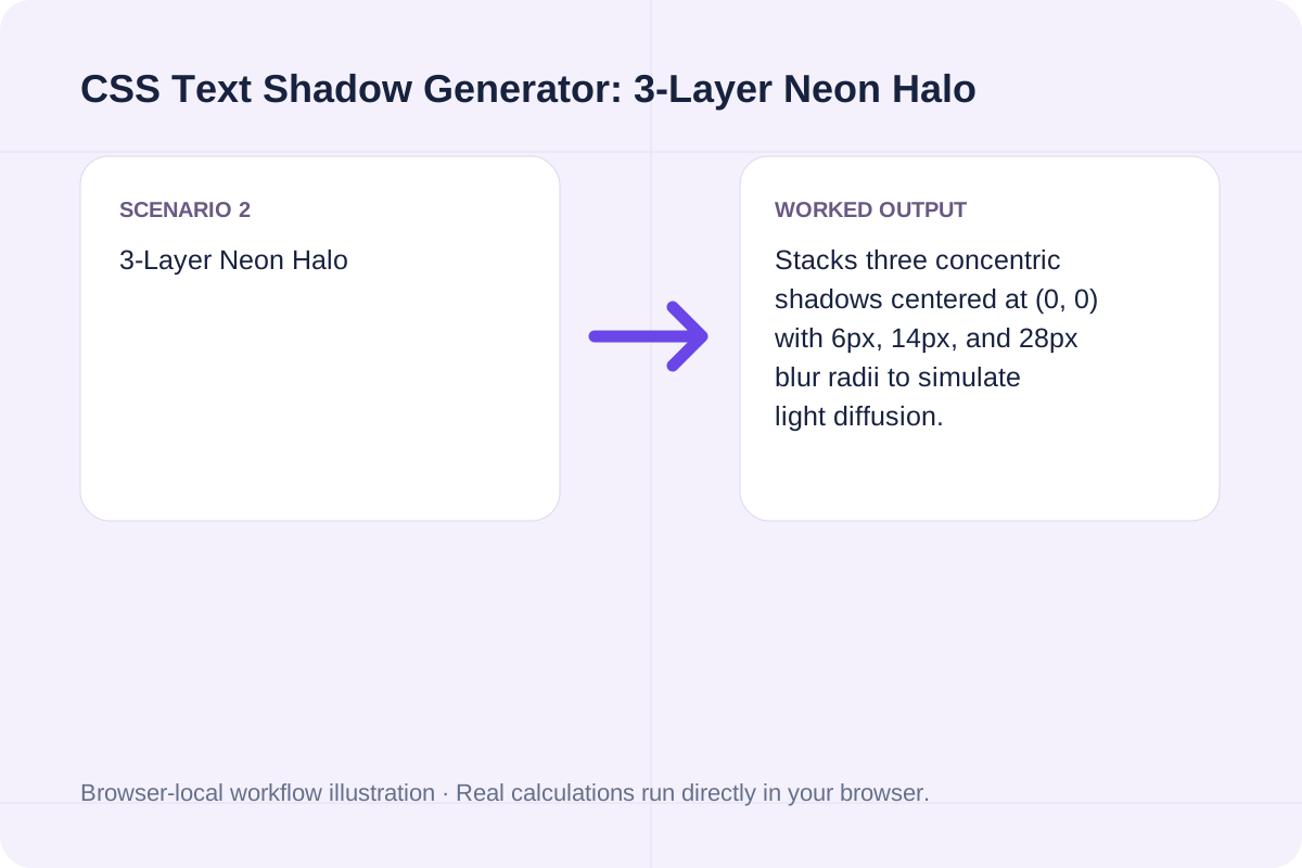
Stacks three concentric shadows centered at (0, 0) with 6px, 14px, and 28px blur radii to simulate light diffusion.
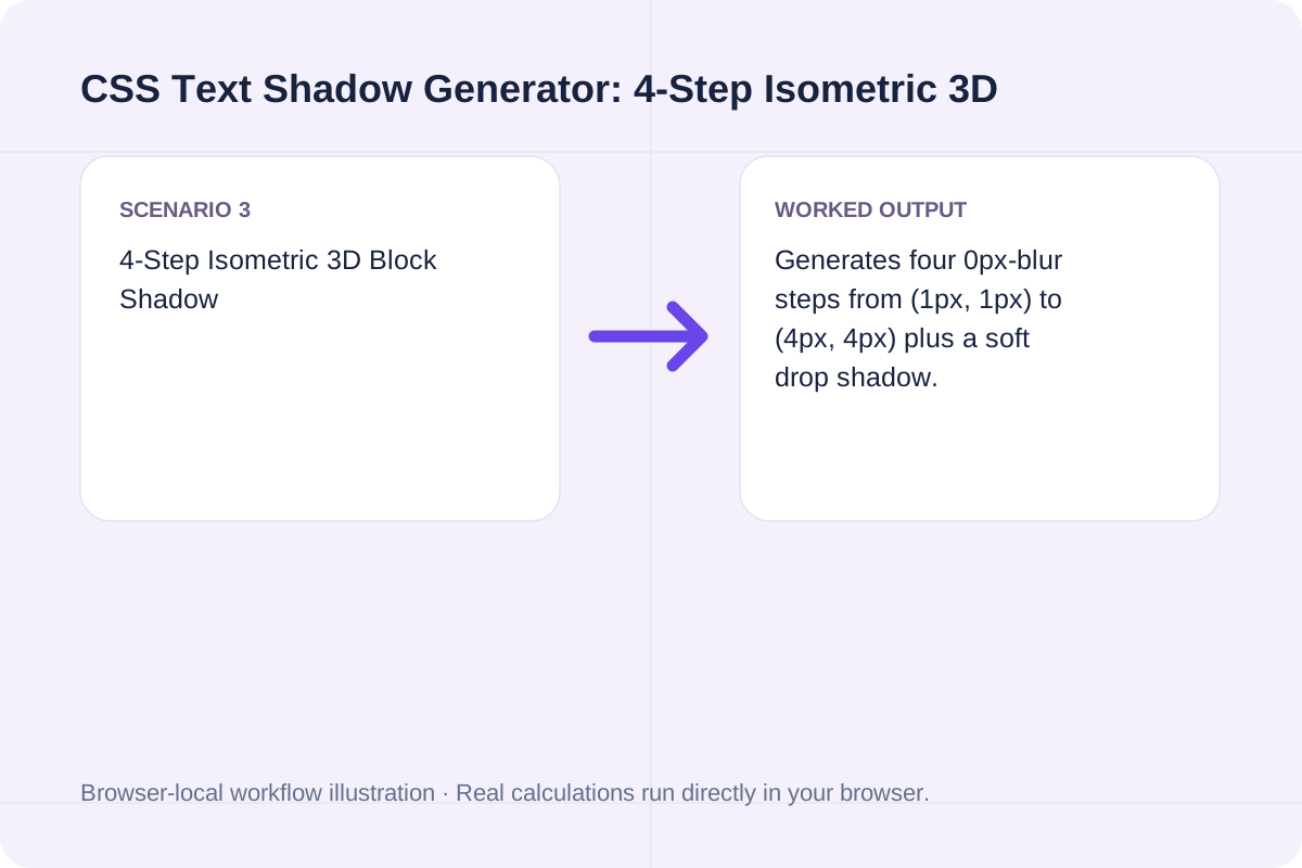
Generates four 0px-blur steps from (1px, 1px) to (4px, 4px) plus a soft drop shadow.
Paste the `text-shadow` line into your heading selector or use the Tailwind `[text-shadow:...]` class.
When stacking multiple layers, browsers render the first shadow in the comma-separated list on top and subsequent shadows behind it.
The output also formats a space-escaped Tailwind v3/v4 arbitrary property class (`[text-shadow:...]`).
Keep blur radii reasonable on animated text.
Avoid animating text-shadow blur radii above 50px on large paragraphs, as Gaussian blur repaints on every frame.
Blur radius must be 0 or greater.
Generate cross-browser CSS gradient text code with linear-gradient or radial-gradient, background-clip: text, -webkit-text-fill-color, and fallback color.
Open tool
Calculate characters per line (CPL), optimal CSS max-width in ch and px, and wrapped line count from container width, font size, and typeface.
Open tool
Inscura is a local AI media library for macOS and Windows with offline AI scene search, smart scraping, NFO export, and built-in playback. Compare vs. TMM.
Open toolChoose another tool for your next calculation, conversion, or text task.

Read the RGBA values at one integer-pixel position and print hex and CSS forms.
Open tool
Draw a single line of supplied text onto the bitmap using a browser sans-serif font.
Open tool
Draw one text watermark at the lower-right corner with the supplied opacity.
Open tool
Apply the canvas Gaussian blur filter to the source bitmap.
Open toolAnswers about using CSS Text Shadow Generator and understanding its results.
Each CSS text-shadow layer takes up to four values: 'offset-x offset-y blur-radius color' (for example, 'text-shadow: 2px 4px 12px rgba(79, 70, 229, 0.45);'). Multiple comma-separated shadows are painted front-to-back.
No. The CSS Text Decoration Module Level 3 specification omits spread-radius and inset for text-shadow. To create a thicker outline or intense glow, stack multiple comma-separated text-shadow layers.
Set offset-x and offset-y to 0px and stack 3 comma-separated layers with increasing blur radii (for example, 4px, 12px, and 28px) using your glow color.
Stack multiple 0px-blur text-shadow layers at 1px, 2px, 3px, and 4px diagonal offsets with progressively darker shade steps.
Choose another tool for your next calculation, conversion, or text task.