

CSS Text Shadow Generator
Generate CSS text-shadow code with horizontal/vertical px offsets, blur radius, RGBA color conversion, and multi-layer neon or 3D extrusion presets.
Open toolConfigure your gradient geometry, angle, and HEX color stops to generate production-ready CSS background-clip: text declarations and Tailwind CSS utility classes.
Enter the inputs, then select Generate Gradient Text CSS.
Result will appear here
The generator validates your HEX color stops, normalizes the gradient angle, and outputs both standard CSS rules and equivalent Tailwind arbitrary utility classes.
background: linear-gradient(θdeg, C1 0%, C2 50%, C3 100%); -webkit-background-clip: text; background-clip: text; color: transparent;
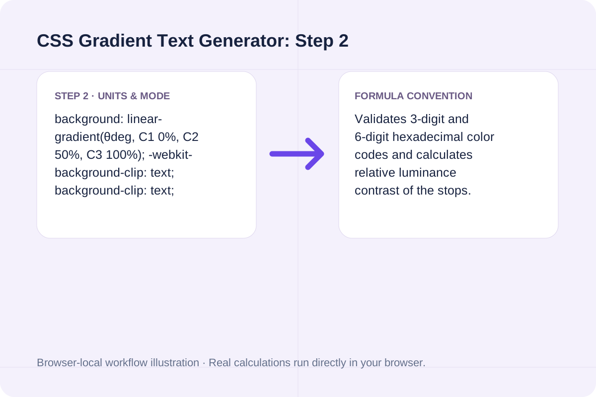
Validates 3-digit and 6-digit hexadecimal color codes and calculates relative luminance contrast of the stops.
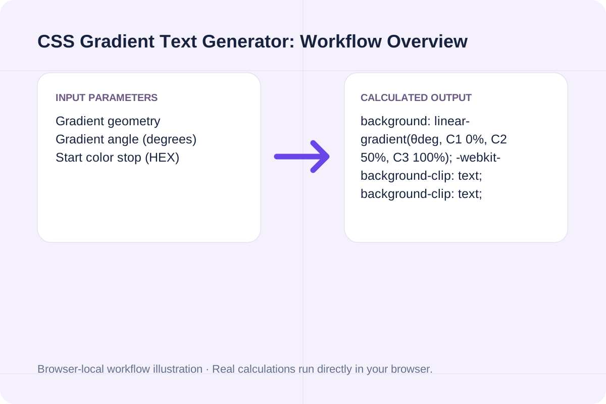
Required CSS declarations for cross-browser gradient typography across Chrome, Safari, Firefox, and Edge.
| CSS Property / Utility | Required Value | Browser Engine Role | Best-Practice Note |
|---|---|---|---|
| background-image | linear-gradient(135deg, #4F46E5 0%, #06B6D4 100%) | All modern browsers | Defines the directional color ramp behind the text box. |
| -webkit-background-clip | text | Blink, WebKit (Safari / iOS) | Clips the background paint strictly to foreground glyph outlines. |
| background-clip | text | Gecko (Firefox), Standards | Standard unprefixed text clipping property. |
| -webkit-text-fill-color | transparent | WebKit & Blink | Overrides solid font color so the clipped gradient shines through. |
| display | inline-block | Layout sizing | Prevents gradient from stretching across empty horizontal container space. |
Create your gradient heading style in three quick steps.
Select Linear Gradient with a 0-360 degree angle (135deg is the SaaS diagonal standard) or Radial Gradient.
Input your starting, optional middle, and ending HEX colors.
Click Generate Gradient Text CSS to get the complete class definition plus Tailwind arbitrary utilities.
Common gradient combinations used in SaaS hero headings and UI badges.
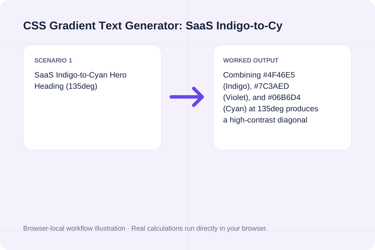
Combining #4F46E5 (Indigo), #7C3AED (Violet), and #06B6D4 (Cyan) at 135deg produces a high-contrast diagonal sheen across large bold display headings.
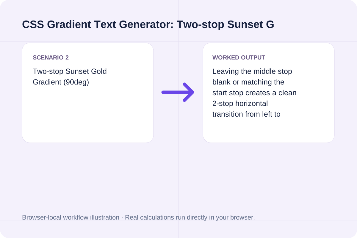
Leaving the middle stop blank or matching the start stop creates a clean 2-stop horizontal transition from left to right.
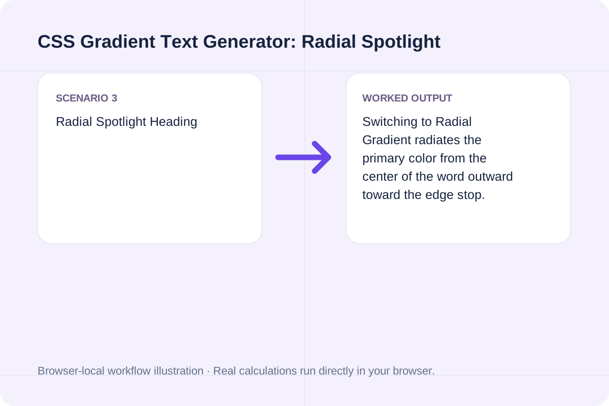
Switching to Radial Gradient radiates the primary color from the center of the word outward toward the edge stop.
Use the `.gradient-text` class on headings (`h1`, `h2`, or `span`) with `display: inline-block`.
Wrap only the highlighted keywords inside a `<span class="gradient-text">` so the color transition spans those exact words.
The output also includes the one-line Tailwind CSS utility (`bg-gradient-to-r bg-clip-text text-transparent`) for utility-first projects.
Avoid applying multi-stop gradients to small body text.
Reserve gradient text for large headings (24px / 1.5rem or larger) with bold font weights (600-800) so thin strokes do not lose legibility.
Start and end HEX colors must be valid `#RGB` or `#RRGGBB` values.
Generate CSS text-shadow code with horizontal/vertical px offsets, blur radius, RGBA color conversion, and multi-layer neon or 3D extrusion presets.
Open tool
Calculate characters per line (CPL), optimal CSS max-width in ch and px, and wrapped line count from container width, font size, and typeface.
Open tool
Inscura is a local AI media library for macOS and Windows with offline AI scene search, smart scraping, NFO export, and built-in playback. Compare vs. TMM.
Open toolChoose another tool for your next calculation, conversion, or text task.

Draw a single line of supplied text onto the bitmap using a browser sans-serif font.
Open tool
Draw one text watermark at the lower-right corner with the supplied opacity.
Open tool
Read the RGBA values at one integer-pixel position and print hex and CSS forms.
Open tool
Clip source pixels to a rounded rectangle and save transparent PNG.
Open toolAnswers about using CSS Gradient Text Generator and understanding its results.
Apply a CSS 'background-image: linear-gradient(...)' to the text element, clip the background to the glyph shapes using '-webkit-background-clip: text; background-clip: text;', and make the glyph fill transparent with '-webkit-text-fill-color: transparent; color: transparent;'.
A full-width block element stretches its gradient across the entire container width rather than just the text width. Setting 'display: inline-block' or 'width: fit-content' scopes the gradient from the first letter to the last letter.
Yes. Safari and iOS WebKit browsers still require '-webkit-background-clip: text' and '-webkit-text-fill-color: transparent' alongside the unprefixed 'background-clip: text' property.
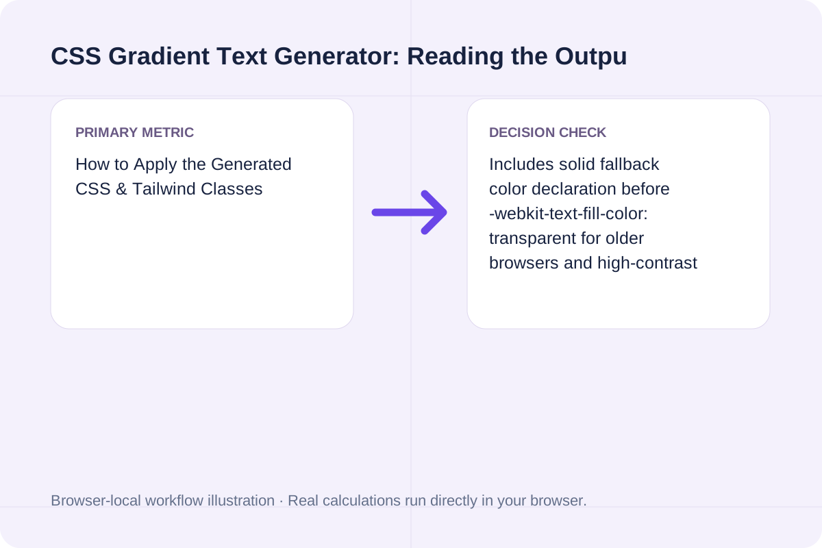
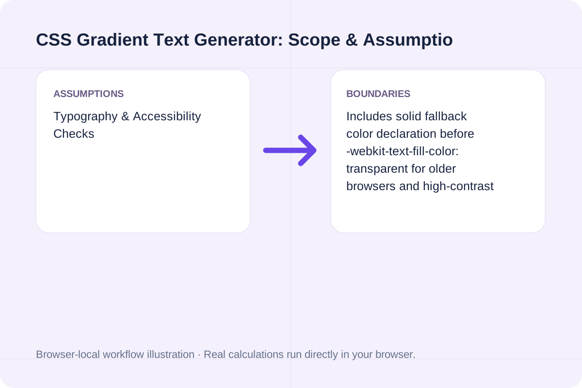
Declare a solid fallback 'color: #4F46E5;' before '-webkit-text-fill-color: transparent;' and ensure forced-colors media queries can override transparent fills.
Choose another tool for your next calculation, conversion, or text task.